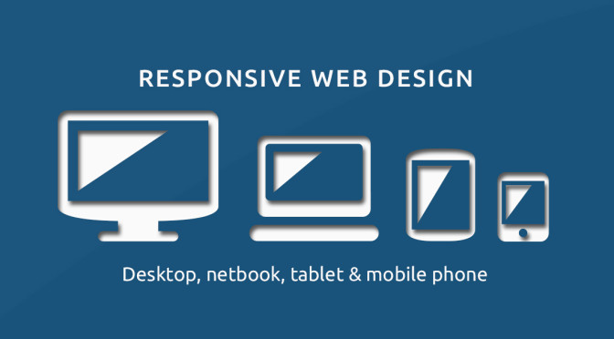
Responsive web design Guidelines for Devices
Responsive web design is no doubt the current trend observed in web designing. Accessing online resources through varied devices and platforms has pushed the Website design and development services to find different ways to improve user experience. Distributing the website content in layouts of different sizes and patterns, and customizing the look and feel of a website as per the needs of customers has become a norm for most web designers.
A normal user may just explore website content simultaneously checking the nimbleness of the device. The user may identify certain lags, but will definitely fail to absorb finer details which enhanced the usability of the device. Nevertheless, web designing is about designing something which is not obvious and strikes an expression of wonder in the user’s eyes!
Web designers use million ideas to give different browsing experience for users. But all of them are variants of these basic web designing layout patterns.
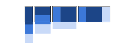
Mostly fluid

In mostly fluid pattern, the grids which may consist of images and content do not vary much across platforms. Mobile app development firms use this pattern for smartphones in which grids appear as stacked columns, with landing page image or content occupying the top position. But in devices such as tablets, laptops, and desktops with bigger screen sizes, the subsections are added below the main grid, which distribute themselves sideways, from left to right. You may also see wide margins in case of laptops and desktops.
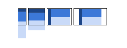
Column drop
The column drop pattern may not hold much difference in grid pattern compared to mostly fluid type in smartphone displays. Even tablets may also feature similar pattern. But in slightly bigger screens such as laptops and desktops subsections may distribute themselves sideways towards the right, with menu bars to the left.
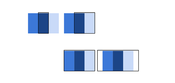
Layout shifter
Basic pattern in layout shifter is very useful in case your website has a menu bar and you want it tucked in a convenient location, either top or left. Smartphone and tablets may follow similar stacking pattern, but in the latter the subsection grids may slightly scale high. In larger screens, menu bars shift to the left side and margins increase.
Tiny tweaks

For companies having websites with simple landing page customizing involves just little tweaks. Such pages can be easily made to scale themselves in case of small screens such as smartphones.
Off canvas
This is very a convenient pattern for social media platforms where menus can be condensed in the top left button or on top. Navigation options can be accessed at the left edge of the screen. A subsection which may consist of sections such as friends list can be accessed by moving the cursor to the right edge of the screen.
Whether it is a web hosting or an e-commerce solutions firm, responsive web design is the element which should be included to reach customers and clients across platforms. If you think your website does not look good on a smartphone or tablet, and want to enhance the user experience, custom website development services may be the solution.